Tuesday, November 24, 2009

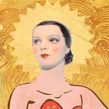
occasionally, a portrait...


Carving out a likeness somewhere between realism and caricature is tricky territory, but that's where I try to steer things. This is a drawing/collage depicting the great American poet Robert Creeley as a fairly young man. He only had one eye and was generally photographed with a patch, but I found this direct image of him, with the blind eye shut, to be more compelling. Robert Creeley died in 2005. Do yourself a favor and read his work.

Wednesday, November 18, 2009

"old school" collage


I used to make collage from tangible things, back when folks cared about the tangible. We've now moved our concerns out into the ether with all our gizmos. I wonder how that will work out in the long run... anyway, here's an example of collage made from street debris, bits of whatever and Piero della Francesca.

Friday, November 13, 2009

Friday the 13th...


This guy seems appropriate for today, a day so laden with goofy portent.

Tuesday, November 10, 2009

seasonal stuffing


This is a collage I've just finished, to send out as a seasonal greeting to clients. As the image evolved, it looked more and more like a medieval tapestry to me, so that's what I went with. Trying to make a turkey beautiful is quite an undertaking.

Friday, November 6, 2009

The New York Times Book Review


It's been a while since I've had a piece in the NY Times Book Review, but I'll have one in an upcoming issue. The review, written by Geoff Nicholson, is of book called "Liver", by Will Self. This was my first chance to use collage in this forum and the book in discussion was a perfect fit. I think the resulting image is compelling and captures the strange subject matter of this set of four related stories. If you're a Book Review junkie, like me, keep an eye out for it.

Friday, October 23, 2009

book covers...


I've been showing my digital collage work around with book cover assignments in mind. So far, some good responses. Here's one I did today that I think has the right qualities for that sort of gig. We shall see...

Monday, October 19, 2009

Charles Wright - for the NY Times


This is a portrait of the poet Charles Wright that I drew for The New York Times Book Review when a collection of his poetry, entitled "Scar Tissue", was released. Likenesses are tricky territory, but I was pleased when a personal friend of the poet contacted me and purchased a print of my drawing to give to Mr. Wright as a gift. That kind of thing is very satisfying to an illustrator, because the work is generally sent out into the world with no expectation of response.

Sunday, October 18, 2009

Joseph Cornell


This man's work has always stopped me in my tracks. The meaning of it all is so evasive, I end up questioning all meaning. That's getting close to defining art for me. Google him if you're not familiar with his mysterious constructions.

Tuesday, October 13, 2009

the occasional poster


Once in a blue moon, I get the chance to illustrate and design a poster. This one was done, a while back, for a production of Damn Yankees.

Sunday, October 11, 2009

the mutual funds guy


I've been doing these drawings for The New York Times Mutual Funds Quarterly for many years now and it's a great gig. First of all, what's funnier than Mutual Funds? Well... a lot, especially of late, but it's still the goal to produce something humorous that conveys the status of the current market. This last quarter was pretty darn great, but... can the bounce-back continue? Apparently there's a sea of doubt out there. The notion of those trampolines with the safety nets (I always need a grid to play with for these) came to mind. Maybe we can bounce back so high we'll have some problems...

Thanks to the section art director, Fred Norgaard, for always coming back to me with these.

Friday, October 9, 2009

The New York Times Book Review


A while back I had a great assignment, drawing for a New York Times Book Review cover featuring Middlesex, by Jeffrey Eugenides. It's a complicated story about a person who is both a man and a woman - strange, but great fodder for illustration. Steve Heller was designing those pages then and The Book Review has long been a great showcase for fine illustration. I'm always honored to be included there.

Wednesday, October 7, 2009

another food cover


This cover for "Corn & Capitalism" has an interesting story. I had done a piece for the Op-Ed page of the New York Times dealing with the US corn industry and it's pervasive power. A while after that editorial ran, I got a call from The University of North Carolina Press. They had seen the Op-Ed and thought the drawing dove-tailed perfectly with a book they were releasing... so, the strange corn drawing got a second life. If only all of my the illustrations would circle back for a second bow. Once in a while these little bonuses crop up (insert corny joke here).

Tuesday, October 6, 2009

and, speaking of animals and records...


This a funny logo I did for another songwriter's record label. I seem to know too many songwriters and not enough fortune 500 executives. The upside is this - you can be playful and design a scrappy-little-dog logo for a record label.

tiny little records, big fat pigs


Remember album covers? Well, I do and I miss them. I was too late to have ever had an assignment designing an LP cover, but I do occasionally design CD packaging and it's a satisfying (if tiny) undertaking. Sadly, CD's seem to be going the way of the buffalo as well, but that's another story. This particular CD cover went the way of the flying pig... it was done for a San Fransisco songwriter named Billy Schafer. I hope the pig has done well for you, Billy. I used a big, huge, ugly pig rather than the go-to cutey-pie. I think it serves to underscore the essential notion here, that anything is possible. Is that true? Hey, what's the greatest album cover ever? Please opine...

Monday, October 5, 2009

The Nation - Food Issue


To the right is the cover for The Nation magazine's recent "Food For All" issue. I designed the lettering and Steven Brower did the cover layout. Inside the issue I did several illustrations and additional lettering as initial capitals. This was a great assignment to work on, and the articles included are all compelling. It was a special treat for me to do an illustration for a piece concerning Wendell Berry, one of my favorite poets, but also a very critical early figure in the sustainable agriculture movement. The piece shown above the cover illustrates a different article, by Dayo Olopade, "Green Shoots in New Orleans".

Saturday, October 3, 2009

a flowery logo...


This is a playful logo I recently created for a garden design business. I wanted to keep it fun and as un-corporate as possible, but still have it pack some identity oomph. I think we pulled it off.

Friday, October 2, 2009

A piece for The University of Minnesota


Here's a nice big drawing I did for The University of Minnesota Foundation. It's tricky to find a humorous yet respectful solution when creating an image about a serious disease, but I think we ended up with a very nice result. I love working for University publications. They're outside the frenzied loop of commercial magazines so the art directors are always calm and easy to talk to.

I'm working in to very different illustration styles of late. This piece is the more traditional, humorous and conceptual. The newer style, which I have been doing more and more of, is digital collage (more to come on that).

So it begins...

I am told I should blog, told this by those who do. So, in the grand tradition of leaping into pools of unknown depth, for the rush (if not a calculated result) here we go. I will be posting artistic musings, design and illustration work, opinions (yikes), and other stuff as I see fit and gradually muster my innate blogness. Please stay tuned.

TR


This is a recent piece from my "digital sketchbook". I will post these as they are finished. They are surreal collages compiled from junk, web images, treasured scraps of this and that, and collected nonsense of all kinds. Towards the end they start to take on meaning. That's when I hit "save" and get out of the equation. The important question being, what does it mean to you?

TR